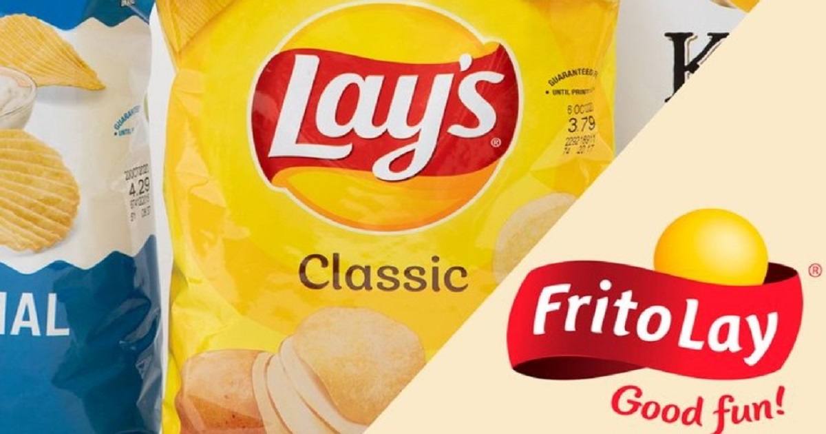
Okay, so this is one of those things you would never think of until someone points it out and you think—wait, how did I not see that? You’ve seen the Lay’s logo. Everyone has seen the Lay’s logo. It’s been around forever. Yellow background, little splash of red, little floaty ribbon thing with the name right in the middle. A classic. It’s in every grocery store and probably half of the vending machines you have seen go by. But apparently, there is this sneaky little design detail that most people just… ignore. Or overlook. Or maybe it is hiding in plain sight and no one cares. Tough to say.
Anyway, Lay’s is an old brand, with it spanning all the way back to 1932, which is crazy when you think of how many snack brands started and ended in that time frame. It was named after Herman Lay—yes, actual guy, not just some randomly made-up name—and it has sort of blown up into this international chip empire over the years. Which, fine, I get it. Chips are addictively delicious. But this is where it gets interesting. The Lay’s logo? It is not just a nice little sunny badge for potato chips. It’s also a not-so-subtle hint to their parent company, Frito-Lay.
You’ve Seen the Logo, But Did You See It?

If you take a good look at the Lay’s logo—or, you know, stare at it longer than half a second—you will start to see that it is not just some random happy circle with white letters on top. That yellow orb in the background? That is not just random design filler. It’s almost a carbon copy of the big round sun shape from the Frito-Lay logo. Not totally the same, but the vibe is similar enough.
The Frito-Lay logo includes some sort of puffy 3D golden ball—sun, chip, or both!—and a swooping red banner saying “Frito-Lay” in white. Then it has “Good Fun!” underneath it, because why wouldn’t you add that? It is loud, a little silly, really big snack industry energy. But the Lay’s logo is basically that shape and color scheme, without it being too on the nose. Almost like an Easter egg. Maybe brand loyalty, but given in a subtle way.
So this “hidden detail” everyone’s referring to is just the Lay’s sun shape kind of mimicking the Frito-Lay logo’s sun/chip/sphere… thing. It is less about hidden symbols and more about branding staying in the family. It’s not like they reinvented the wheel—they just put a new shine on it, made it simple, and made it look similar without splattering “By Frito-Lay!” all over the front.
I find it kind of funny. When you look at Lay’s, you’re probably not thinking “Yes, the PepsiCo snack conglomerate that also owns Doritos and Cheetos,” but you are surely absorbing that continuity without even realizing it. Just some soft visual cues. Yellow circle. Red banner. Same warmth, same energy. A slightly different execution.
Why a Sun? Why Not a… Potato?
And then there’s the symbolic aspect which maybe sounds like reading too much into a bag of chips, but hear me out. The sun shape in the logo doesn’t happen by accident. It’s all about a feeling of warmth, freshness, vitality. Everything joyous that you’d want to associate with your food. The Frito-Lay sun seeks to say, “We’re fun! We’re fresh! We definitely didn’t sit in a warehouse for nine weeks before arriving in your pantry!”
Similarly for Lay’s, the yellow circle essentially gives you a sunny, gold, just-fried vibe. It is of little consequence what conditions the chips were made in (presumably not literally on the sun), the image offered is enough. The brand says “crispy,” “fresh,” “ready to crunch,” without taking one step further to convey that message.

And the colors? Oh yeah, that’s another whole layer. Yellow, according to marketing folks, is an appetite trigger. Cheerful. Fast food places love it. Red is similarly appetite-triggering, but it’s more of a shout. Red grabs awareness, but also makes someone feel something. Together, red and yellow are basically the hack code for snack packaging. There’s a reason why 50% of the products in the chip aisle are red and yellow in color. It’s Pavlov yet somehow also cheese dust.
Next time you hold a bag of Lay’s, maybe give the bag a solid minute of stare time. You will literally see it. The familiar shape, the color echo, that subdued nod to the sun chip shape of the father brand. It might be subtle, but it’s there.
Whether or not it matters is a different story. Most people are in the process of ripping the bag open to overthink the conscious choices of the design. But nevertheless, there’s something somewhat corny about knowing that the logo is not random. It’s a little quiet tie back to a name that has been etching itself into your subconscious for decades.
Feel free to go eat your Classic or Sour Cream & Onion or whatever your dip is, because now you’ve got this bit of trivia bouncing around in your head too. Lay’s didn’t arrive from nothingness. They’ve got an entire powerhouse of snacks that has been quietly winking at you with the logo the entire time.
Oh, and if you’re into this sort of “brand logos have something secret” rabbit hole, apparently there is something in Wendy’s logo too? That one’s weird emotional though. You’ll see when you look.


