
I’ve lost track of how many times I’ve seen a Chupa Chups lollipop before I thought about it. Until the day I found out I didn’t know where that flower-shaped logo originated. The Chupa Chups logo meaning is much more than just a brightly colored and sweet image, it’s directly tied to one of the most well-known artists of our time, Salvador Dalí. Yes, that Salvador Dalí.
A Short Background of Chupa Chups
Chupa Chups started in Spain in 1958 when Enric Bernat decided that children should be able to enjoy candy without having sticky fingers. To achieve that goal, Bernat placed candy on a stick, something that may seem obvious today, but was not at the time.
Although the candy was successful early on, the branding was missing. From my research on older product launches, this is typically the point at which a company realizes that a successful product requires a solid visual identity. Bernat realized that his candy required a brand identity that would be memorable to consumers and stay in their heads as easily as the candy stayed in their mouths (Sorry, I could not help myself!).
The Creation of the Chupa Chups Logo
Here’s where things get very interesting. In 1969, Bernat asked Salvador Dalí to create the logo for Chupa Chups. This is not typical of who is chosen to provide a branding service for companies.
What I think is particularly interesting is how quickly it all happened. According to reports, Dalí took less than an hour to sketch the logo. Although that is not what I find the most astonishing, great designers can produce excellent work in a short period of time, once they have an idea.
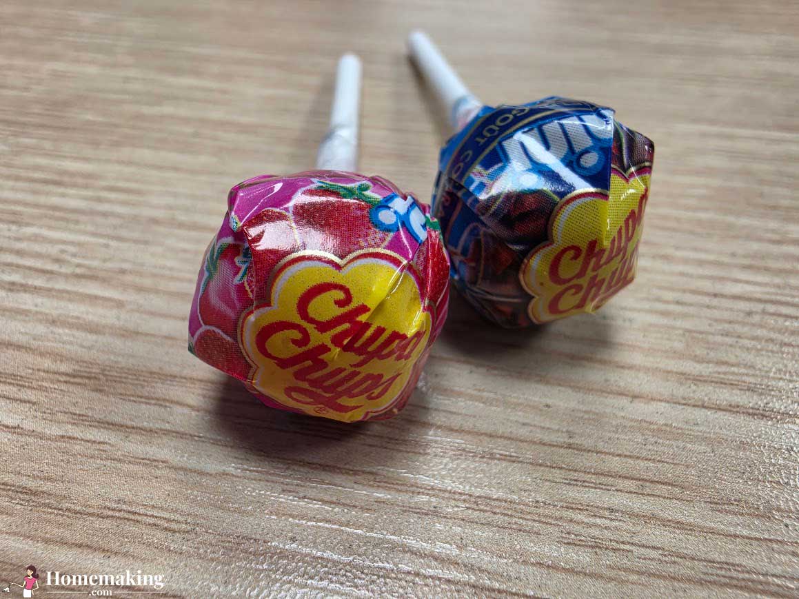
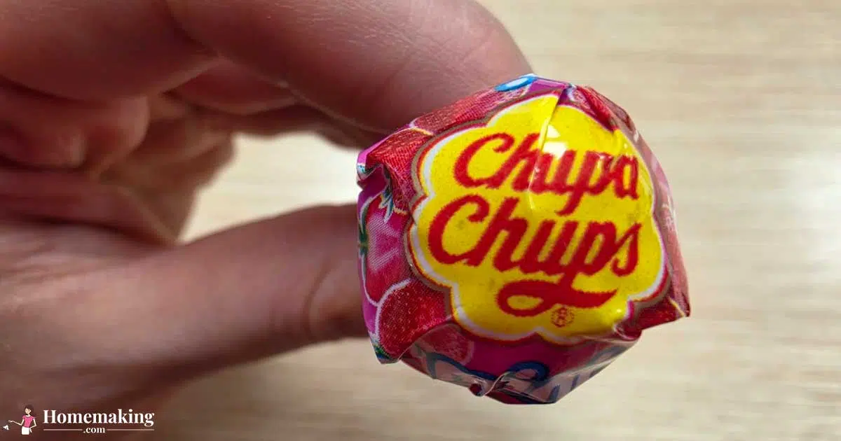
Dalí’s Chupa Chups logo included several features that are still used today. First, the rounded, flower-shaped outline. Second, the bold, bright yellow color in the background combined with the red lettering. Both are very eye-catching and scream for attention.
When studying branding, one thing I learned the hard way is that placement is as important as design. Dalí recommended placing the logo on top of the wrapper versus the side. I can assure you that making this recommendation made the logo visible, regardless of the direction the candy was displayed. That is the definition of smart branding in its simplest form.
The Meaning Behind the Chupa Chups Logo
Let’s get into the actual meaning behind the Chupa Chups logo. As stated above, it is not overly complicated, and that is somewhat the purpose of it.
The flower shape creates a friendly, nearly cheerful feeling. The shape is not sharp or aggressive, it invites the consumer to engage with the product. From my personal perspective, the roundness of the shape contributes to its appeal to children, which is the target demographic.
The colors of the logo also make a large contribution. Yellow is vibrant and energetic, while red is stimulating and attracts attention. These color combinations are being used in branding for food products and other products again and again. They simply work.
Finally, the typography of the logo rounds out the design. Easy to read, rounded, and playful. I have come to learn that simplicity in design generally leads to success in the long run. This is an excellent example of such.
In general, the logo conveys happiness, sweetness and fun. It does not try to convey anything else. There are no underlying symbolism, nor does it rely on overthinking. Instead, it provides simple and effective design.
What Does “Chupa Chups” Mean?
Lastly, I wish I had been aware of this previously. The name Chupa Chups has a relatively direct meaning.
“Chupa” is derived from the Spanish verb “chupar,” which literally means “to suck.” Therefore, “chupa” is essentially a command, “suck.”
“Chups” does not have a specific definition. Rather, it is more of a playful addition to the word, similar to a branding flourish. When taken together, Chupa Chups roughly translates to something like “Suck Suck,” which is humorous in English, but perfectly fits the product.
Upon learning this, it actually added a level of cohesion to the entire brand. The name, the product and the logo all correlate in a very direct manner.

How Do You Pronounce Chupa Chups?
Alright, let’s settle this. I have been mispronouncing Chupa Chups for years.
To correctly pronounce Chupa Chups, it is pronounced: “CHOO-pah CHOOPS.”
Phonetically, the Spanish pronunciation is very close to the English version. Once you hear it, you’ll never forget it.
Common Mispronunciations? I’ve heard it said as “choopa choops” using stretched vowels, or even “chop-a chops”, which… no. Based on my own experience, pronouncing it naturally and without overthinking it is the best approach.
Why the Chupa Chups Logo Still Works Today
Another aspect of the logo that is impressive is how little it has changed since the logo was designed. In fact, this in and of itself speaks volumes.
In my experience, brands whose logos rarely require updating usually had it right the first time. The Chupa Chups logo is instantly recognizable, whether you’re in Spain, Georgia, or somewhere in the middle of the globe.
Nostalgia plays a role, yes, but the logo remains relevant. Simple, bright, and fun, it has not aged in the same way that many logos do.
Honestly, that’s the lesson here. Great design doesn’t chase trends. It works.


